Wednesday, March 30, 2011

Ideas for a cheap headboard wall makeover

Apartment Therapy.com

In many homes, the bedroom often gets the least decorative attention even though it's the room where we normally spend the most time. And it's no wonder, bedroom furnishings aren't easy on the wallet. However, if you start with the headboard wall — the focus of the room — and go from there, it's easy to establish a vision and get the creative ideas flowing.


• Gallery Wall. I know there is a hot debate about the safety of using shipping pallets as furniture, so let's not even go there today, but I will say that creating a gallery wall around a simple bed frame — even one with no headboard at all — creates an instant focal point. Pick objects that can be affixed securely to the wall, and if you're in the earthquake zone, skip the suggestion entirely. Make sure that your hanging art is hung high enough that sitting up in bed won't cause an avalanche.
• Painted Headboard. You can be as elaborate (picture 3) or as minimalist as you'd like, but defining your sleep-space with a drawn or painted headboard is the most cost effective way to anchor your bed, especially one lacking in an ornamentation.
 Fabric Headboard. There are several ways to spruce up a bed with fabric, some being more costly and labor intense than others — think queen canopy — but simply hanging a tapestry or yard of fabric behind the bed will anchor the space and give it an instantly "finished" look. Use regular curtain rods or simple dowels and eye-hooks to affix them to the wall, and be creative about where you find your fabric — think table clothes, twin flat sheets, etc.
• Wallpaper and Decal Headboard. The decal craze may have lost some steam in the last few years, but it's still a great alternative for renters, dorm dwellers, or anyone seeking to spruce up a plain-jane frame without breaking the bank. Check out Blik anduppercase living for some great headboard decals, or follow Martha Stewart's instructionsfor creating your own out of wallpaper.
Images&Content: "Ideas&Opintion" apartmenttherap Images: 1: Serena & Lily, 2: via decorpad, 3: Apartment Therapy: Chicago, 4: Homes and Gardens, 5: Southern Accents, 6: Martha Stewart, 7: uppercase living

Cool ideas right? Well... Here is a How to:
All Pics and words by Metelandmud
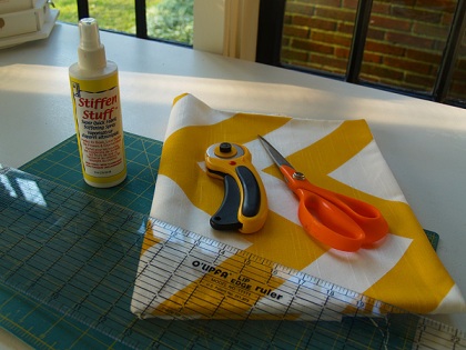
For this project I used:
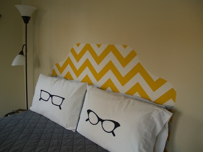
- 1 yard of good quality decorator fabric, which I bought at Premier Fabrics in Germantown. I chose Zig Zagin Corn Yellow.
- Stiffen Stuff
- Good fabric scissors
- An iron

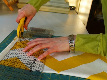
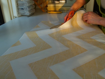
Step 1: Cut the selvedge off and square up the fabric. If you have a queen bed, you’re going to want to keep as much of the width as possible, so be sure to cut close to the edge of the selvedge.
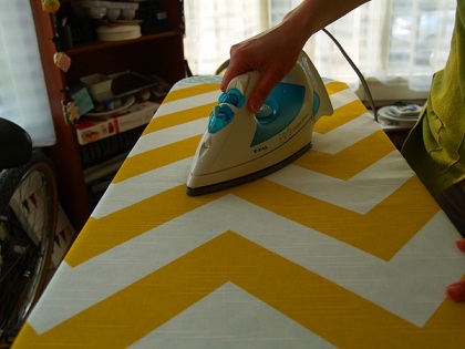
Step 2: Iron that puppy to within an inch of its life. Once you start spraying you’re not going to be able to iron it again, so you want to get it as flat as possible now.
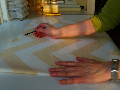
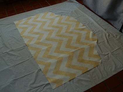
Step 3: Fold the fabric in half lengthwise and sketch on the shape of your headboard. Since my fabric is so angular, I decided I wanted the shape to be really fluid and curvy.
Step 4: Cut out your headboard.
Step 5: Lay your headboard, face down, on a flat surface, with a tarp under it to keep your floor or table from getting sticky (I use a shower curtain liner from the $1 store… way cheaper than an actual tarp). I planned on spraying the entire back, but within a few minutes, my fingers were cramping and the spray bottle started sticking. So instead, I opened the bottle, poured a little into a bowl (one I didn’t mind never eating out of again), and brushed it on with an old paintbrush. Try to get at least a little glue on every inch of the fabric, but be SURE to REALLY SOAK the edges. Let it dry overnight.
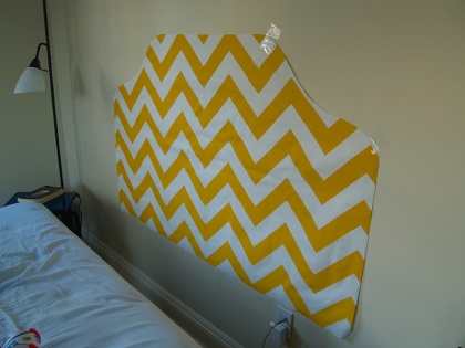
Step 6: Once your headboard is completely dry, it’s time to place it on the wall. You can use packing or masking tape to temporarily hold it up. Make sure it’s straight before you start ironing!
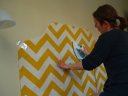
Step 7: Set your iron to high heat with no steam. I started in the middle, ironing the middle section from top to bottom, then working my way out. Be sure to focus on the outer edge, making sure it is firmly attached all the way around.
And you’re done! I’m really happy with how this project turned out. It really brings life into my bedroom, which has felt pretty lifeless since I moved in. And the best part is that it cost about $9, didn’t take much time, and is completely reversible if I get sick of it!


Tuesday, March 29, 2011

Punctuation

Just an FYI... I have no idea why SOME (strangely, not all) of my posts are in all lower case letters.
I have nothing against capital letters.
I actually like them, and use them when I write my posts... they just dont "post" as upper case.
Just wanted to let my 12 wonderful, i love you, thank you for following me, followers know that I do know how to properly use capital letters.
hmmmmm

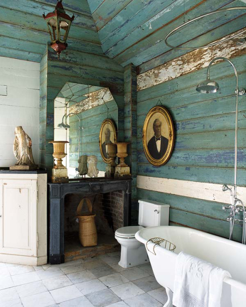
Color Combo: Seafoam Turquoise and Canary Yellow

The color combination of seafoam turquoise and bright canary yellow are both very intense colors, two that dont really seem like they would go well together. but something makes them work!
I don’t much like baths, but the portrait of the guy in a tux watching thru the mirror amuses me.
Via: sweethomestyle: Love baths
I love the calm neutral seafoam turq on the walls with the yellow breath of fresh air. (But watch out for the guy in the mirror!) 


Images via michelevarianblog and Domino

Designer Libby Langdon


HouseofTurquoise.com featured a great design yesterday on their blog about designer  Libby Langdon. I love the simple elegance of this Newport, Rhode Island twin bed guestroom. Her choice of wall color and upholstery complement each other so well.  I also like how she incorporates a slight nautical theme into to room. 

Hey Sister, Guess What?

Monday, March 28, 2011

Monday Morning Inspiration

My Monday morning did not get off to its usual start... for a few reasons.  Although I was able to get away on my little weekend getaway to visit some dear old friends I spent 1/2 the trip in bed with the flu, geez it sure is embarrassing and annoying to be a sick house guest! But all was not lost as we did get a full day to explore Pete's "Factory", check out Pittsburgh, catch up, laugh and plan some exciting design projects for the upcoming months! The trip was great despite the 24 hours I hopefully will soon forget. So this Monday, re-assured that the store is sailing along fine without me (WOW did Louise and Kelly have an awesome weekend while I was gone!! You guys are awesome!) I decided to stay home to rest, and make sure my 7 year bug has fully been kicked. Its sort of nice having a sick day to catch up on reading and resting around the house. Thank you Boo and Pat who are working in the shop today! Your the best.
So... while I get to catch up on my rest, I also get a chance to catch up on some favorite blogs and magazines. 
 I  loved the most recent blog post I read this morning on the blog habituallychic, by Heather Clawson... have you read it? if not take a look... (copy is from Habituallychic, except for my blurbs in green.)
Chic and Colorful and Art Filled

The calendar says spring but the temperature says winter. Makes me wish I had a conservatory like Alexis and Trevor Traina in San Francisco. Vogue featured the home in the December 2009 issue and just posted some party pics online today.  It was fun to see the dining room set for a chic lunch to celebrate the new Balenciaga exhibit at the de Young Museum and a visit from Hamish Bowles who curated it. The moss green pillows are a lot of fun, they remind me of chilled pea soup... which was served in little ramekins in the conservatory for the event!

The Trainas renovated the home and added the conservatory by Amdega. The furniture was designed by Ann Getty who collaborated on the interior design with the couple and interior designer Thomas Britt.

The dining room set for lunch.

I love the pop of pink stemware against all the green in the room.
The stemware is beautiful, as is the Flora Danica Fungi service porcelain from the 1790 pattern...
Perfect for Spring!

The chairs were designed by Ann Getty and Andrew Fisher designed the abalone topped tables.  The chandelier was found at Coleen & Company. I love the peacocks...stay tuned for an "inspiration" post in the work son Peacocks!

The entrance hall is perfect for tricycle riding.  The artwork is Studio Wall Drawing: 13th May 2004 by Keith Tyson.

Another Keith Tyson painting, History Painting (Baden-Baden, 1942) hangs in the entrance gallery.

Thomas Britt thought the red velvet by Sabina Fay Braxton would be the perfect backdrop for Trevor Traina's photography collection.  Queen Elizabeth II, 1999 is by Hiroshi Sugimoto.

Alexis and Trevor Traina with their children in the drawing room. For a minute I forgot the images are from DEc 2009, I was thinking whats with the Christmas Glockenspiel ?

Thomas Britt also designed the Lucite banister which adds a modern touch to the old house.  Hanging on the stairs is Walking Cake II by Laurie Simmons.  The artist's daughter Lena Dunham wrote, directed and starred in an independent filmTiny Furniture which is also worth checking out.  Hope this colorful home brightened your day!
Thanks for the Inspirational Post by Habituallychic!

Photos by Andi Hatch and Francois Halard

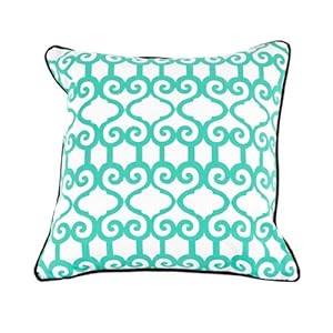
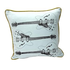
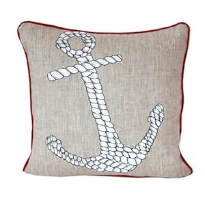
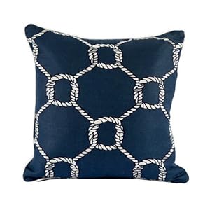
Fun Modern Throw Pillows

We are excited about the new fun graphic thrown pillows 
we just unpacked! Here is a sneak peek of a few we have...

All of these pillows are in-stock (as of this post) and are 20"x20" with down inserts. 
$88.00 each (15 % off if you buy 2 of the same design)
Room Service Natural & Neutral Collection Dream Laugh Peace Love Pillow, 20 x 20-inch, Oatmeal Linen/Black

Room Service Nautical Collection Nautical Boat Wheel Pillow, 18-inch x 18-inch, Navy Blue/RedRoom Service Nautical Collection Nautical Boat Wheel Pillow, 18-inch x 18-inch, Oatmeal Linen/Yellow/Blue


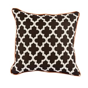
Room Service Retro Mod Collection Marrakesh Pattern Pillow, 20-inch x 20-inch, Oatmeal Linen/Orange/Brown
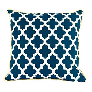
Room Service Nautical Collection Nautical Moroccan Pillow, 20-inch x 20-inch, Navy Blue/White/Yellow
Room Service Retro Mod Collection Moroccan Pattern Pillow, 20-inch x 20-inch, White/Blue/Chocolate
Room Service Urban Arts Collection Grooves Guitar, 20-inch x 20-inch, Blue/Brown/Green


Room Service Nautical Collection Rope Anchor Pillow, 18-inch x 18-inch, Navy Blue/Yellow


Room Service Nautical Collection Rope Anchor Pillow, 18-inch x 18-inch, Oatmeal Linen/White/Red
Room Service Nautical Collection Nautical Rope Pillow, 20-inch x 20-inch, Navy Blue/White
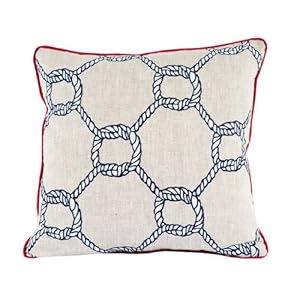
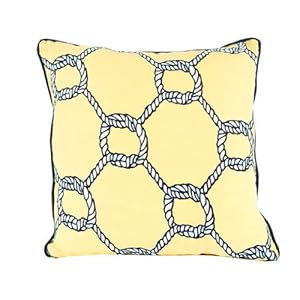
Room Service Nautical Collection Nautical Rope Pillow, 20-inch x 20-inch, Oatmeal Linen/ Red/ White/ Navy BlueRoom Service Nautical Collection Nautical Rope Pillow, 20-inch x 20-inch, Yellow/Navy Blue/White


Thursday, March 24, 2011

Back to the future

I just saw this on the blog deargolden, and thought it was pretty cool... Take a look


These photos are from a  photography project by Irina Werning, called Back to the Future. I agree with the original author that the detail is amazing and the way the people re-create their own facial expressions astounds me a bit. Hmmm... Do you have any pictures you think you could reenact? Lets see!